HOW EFFECTIVE IS THE COMBINATION OF YOUR MAIN PRODUCT AND ANCILLARY TEXTS?
Other products want to be easily identified by their titles as solid consistency of the titles will help relate something that is advertised to your product so it is easily recognised.
Our Brand

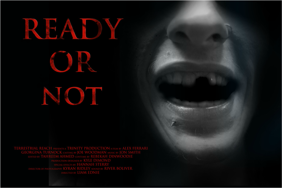
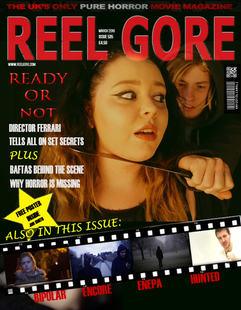
In all of our products - Magazine, Trailer and Poster - we have challenged convention by not being consistent. Our title's font, colour and text are slightly different as we wanted to make each product unique so it would capture the audience in different ways. For example we have used the same font so that the products can still be recognised as one and the same but it is also different as the colour and effect used on the fonts have slightly changed between the products, but can still be seen as the same because they still contain the same font. We have done this to help grab the audience in different ways so that they do not just see it as bland and therefore can captivate their attention and make them feel interested in the product and want to watch it. This will also allow our products to easily be defined compared to other competing products, allowing us to have the edge over other products.
Other Brands
Star wars
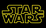
Star Wars has featured consistency throughout all of their films and branded products. The most noticeable brand identity feature Star Wars has is the font of the logo (SF DISTANT GALAXY font) and the yellow colour of the writing. This means that the label has became iconic and well known meaning that it is easily recognised meaning that they may be able to relate to the products and be interested in the product as they recognise the product label.
This font is not just for linking a character or idea from Star Wars - it is the way the entire canon universe of the series will be represented. It comes from an era where people believed that the future would be lasers, flying cars in busy metropolises, where missiles and rockets are still in use and aliens can still be seen to wear robes and talk mystically. The font reflects the idea of futurism in a time
Superman
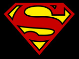
When people see the logo on the left people instantly know it is Superman. This has become so iconic because it is simple but yet striking because of the layout and colours. Due to how iconic this logo has become it is now been able to be identified as it's own product and branding allowing them to release products with this logo and for it to be able to be easily sold. This also means that it is easier for them to gain more revenue with products under this image of branding due to how iconic and popular it has become.
Superman, originally, was designed from a representation ofAmerican culture - Strong, determined and free. In a lawsuit between Warner Bros. Inc. and ABC Inc., the court describes him as such:
"Superman looks and acts like a brave, proud hero, who has dedicated his life to combating the forces of evil.... Superman performs his superhuman feats with skill, verve, and dash, clearly the master of his own destiny."
His simple backstory and relatable mindset makes him possibly one of the most easiest characters to associate with and therefore believe in, despite his somewhat "Marty Stu" status amongst superhero characters making him somewhat more of a boring character if not for this and his weakness to Green Kryptonite, a fictional and powerful mineral that weakens him.
