Production Company Title
Trinity Productions
This is our Production Company Video. In our video we layered two layers over each other to make this nice effect. Our Production Company title font in this is called Helvetica CY and the font size is 81.
This is our Production Company Video. In our video we layered two layers over each other to make this nice effect. Our Production Company title font in this is called Helvetica CY and the font size is 81.
Distribution Company Title
Terrestrial Reach Films
Terrestrial Reach Films is our Distribution Company's name. We used an animated background layer and the font is also animated and called Assembler in Final Cut Pro. We used the same font name, Helvetica CY, to keep continuity in our work but a different font size of 63 to keep the title in proportion with the background layer.
Terrestrial Reach Films is our Distribution Company's name. We used an animated background layer and the font is also animated and called Assembler in Final Cut Pro. We used the same font name, Helvetica CY, to keep continuity in our work but a different font size of 63 to keep the title in proportion with the background layer.
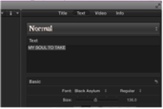
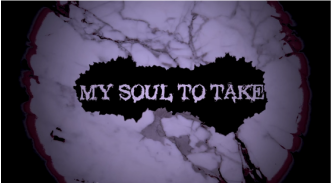
our as ots - my soul to take
|
This font is called Normal, it was chosen because it fit well with our theme in our OTS of dark mysterious figures and shadows.
The font size is at 136; this is in proportion to everything else in the OTS. The colour of the title and texture of the background fit in well too as it resembles an eye. There is red around the corners of the 'eye' resembles blood. This background and blood consolidates the theme of mystery and death. |
Other titles in our as OTS:
We chose the font Helvetica throughout our OTS like in our Production Company and Distribution Company titles. The font was red to keep with the theme of the OTS of dark and shadows. The font size was varied to add effect to the titles, the overall font sizes was 74-72 and a size of 50 for the intro into the persons name.
Below are some comparisons between out OTS and other successful movies like the Grudge...
Below are some comparisons between out OTS and other successful movies like the Grudge...
the grudge
At the beginning of The Grudge the titles are similar to ours with the Distribution Company in the way of they have the same animation when coming into the video. The end of video is very similar to our Production Company as it has an layered animated background.
scream 4
When the video starts the titles blue, this fits in with their Production Company's titles and the whole theme of the killer in scream. His mask resembles a ghosts face and ghosts have connotations of being a mix of blue and white like the titles in the video you see.
the cabin in the woods
The beginning of the video their Production Company has a red title and animated background. This goes along with our red titles and animated backgrounds, we went along with convention with the red titles throughout like in this video.
sin city
We took inspiration from Sin City for our whole video. We included black and white images into our video and red titles similar to the Sin City's video.
(AF)
