In what ways does your media product use, develop or challenge forms and conventions of real media products?
using conventions:
|
|
1. Our casting decisions do not challenge the archetypal convention -which is a female victim chased by a male killer- therefore it conforms, as we see our antagonist as a male chasing down and killing multiple female protagonists, our male antagonist consequently so uses his power and dominance to hunt and kill the fragile female victims. We thought to keep this convention running through our media product as if we strayed away from the conventions the trailer could've possibly been too different to the traditional conventions and might have ended up not being as effective as a horror trailer. By keeping to tradition we have created an impact with our trailer. We also believe that with the audience being typically men and women aged 18-25 casting can relate to the people watching.
2. We complied to conventions as we had the killer using weapons such as knives, mallets and various other tools. This is very typical for horror films as these types of weapons are personal and scary- more scary than a gun - we thought if the killer is very personal and speaking directly to the audience we should be consistent with this factor and use personal and daunting weapons. 3. We edited our media product to have quick paced shots, building up to the end of our trailer. This is a common editing feature of many trailers as most have similar fast paced shots toward the end of the trailer with fast paced music creating an impact and adding tension to the trailer. This example of editing also gives the audience a hint towards what type of killer they are dealing with, by showing our antagonist strangling someone and hitting people with the mallet it shows that our killer is personal and very violent. |
developing conventions:
1. We developed conventions by using the psychological state of mind with our killer. As our antagonist isn't the typical horror killer we developed his character by creating a psychological element to him as he sees the murders as a game, this creates more depth to the character and instills developing conventions to the archetypal strong, violent male killer.
2. Instead of having the usual horror based on one sub-genre we have combined two, thus developing conventions. We have combined the sub-genres of slasher and psychological. The characteristics of slasher films include a lot of violence which we have included in our product, they also are built up of suspense and mystery which we have tried to incorporate in our product. Then we have also tried to embrace the psychological sub-genre, which relies on characters guilt, beliefs, fears and their emotional instability which we have emulated in our product.
2. Instead of having the usual horror based on one sub-genre we have combined two, thus developing conventions. We have combined the sub-genres of slasher and psychological. The characteristics of slasher films include a lot of violence which we have included in our product, they also are built up of suspense and mystery which we have tried to incorporate in our product. Then we have also tried to embrace the psychological sub-genre, which relies on characters guilt, beliefs, fears and their emotional instability which we have emulated in our product.
challenging conventions:
1. We aimed to make our killer anonymous yet wanted a feeling of closeness and familiarity for the audience with the killer. We make the killer talk closely and directly into the camera making an uncomfortable situation for the viewers and that creates an empathy for the audience with the victims crossing paths with this antagonist.
2. We wanted to challenge conventions by having the antagonist talk directly to the audience and explain what he is doing and how he feels. Usually there is a victims account showcasing their fear and panic, yet we have chosen to let the audience know the problems the killer faces in regards to psychological issues and the way he acts, which isn't like the usual conventions.
2. We wanted to challenge conventions by having the antagonist talk directly to the audience and explain what he is doing and how he feels. Usually there is a victims account showcasing their fear and panic, yet we have chosen to let the audience know the problems the killer faces in regards to psychological issues and the way he acts, which isn't like the usual conventions.
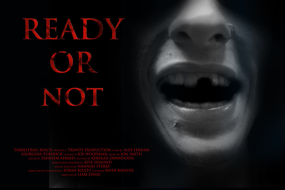
our poster:
For our poster we challenged conventions by not using the antagonist in the shot. Instead we used one of the main victims. This we felt was going to instil more fear into the audience by them maybe thinking that the killer has obviously hurt him and they way we have used the picture makes people frightened that it'll happen to them as it is something most people fear.
We conformed to conventions with our poster, as with most horror genre posters they are all dark colours which we have reinforced within our poster as this horrific picture of Joe is in black and white with shadowing around the face making it dark and mysterious. We also conformed with our choice of font. Our font is in very formal text, in most horror genre posters the text is mostly always classic and smart, as these fonts for titles are represented to be scarier than other, more interesting fonts. Our choice of colour in our font is also textbook, as the red colour of the title attracts attention from the black and white background. Red is a popular colour for fonts within the horror genre as it represents the colour of blood. Therefore, to create an effective and powerful poster we conformed to conventions and our final product is a successful horror poster.
We conformed to conventions with our poster, as with most horror genre posters they are all dark colours which we have reinforced within our poster as this horrific picture of Joe is in black and white with shadowing around the face making it dark and mysterious. We also conformed with our choice of font. Our font is in very formal text, in most horror genre posters the text is mostly always classic and smart, as these fonts for titles are represented to be scarier than other, more interesting fonts. Our choice of colour in our font is also textbook, as the red colour of the title attracts attention from the black and white background. Red is a popular colour for fonts within the horror genre as it represents the colour of blood. Therefore, to create an effective and powerful poster we conformed to conventions and our final product is a successful horror poster.
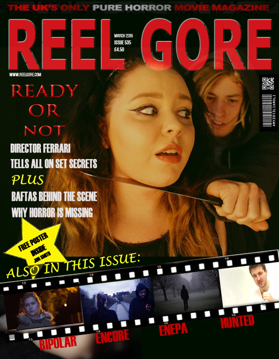
our magazine:
For our magazine cover, we challenged and conformed to specific conventions.
We conformed to horror magazine conventions by the use of text on our poster, this text is similar to the text used on our poster, therefore becoming a constant in our branding of the trailer/film. We showed the film strip of all different trailers from this year to make it seem more realistic as if we have promoted other films within our own product, this is another conformity to usual horror magazines as there are many similar examples of this. We have also conformed to conventions by the use of applying a date and barcode to our magazine, we included these features so that we can have our trailer look realistic and specialised.
We challenged convention by using the main image of the magazine being a shot from the trailer that we thought of as particularly striking. It shows a mysterious situation and emphasises the genre of our trailer. We also challenged convention by not having a glamorous image as the main feature of our magazine in keeping with our goal of making it reflective of our trailer.